Northwood is a UK-based property management and lettings company with an established brand in need of a fresh direction. The brief was to modernise without starting from scratch – evolving an existing identity into something more contemporary, cohesive and capable of working hard across every channel their business relied on.
Northwood came to us looking to evolve their brand identity – modernising the overall look and feel while preserving the integrity of their existing logo. The work needed to stretch across every touchpoint: visual identity, typography, photography, digital platforms and brand communications. The goal was a cohesive, contemporary brand that could speak equally to families, students and rental companies.
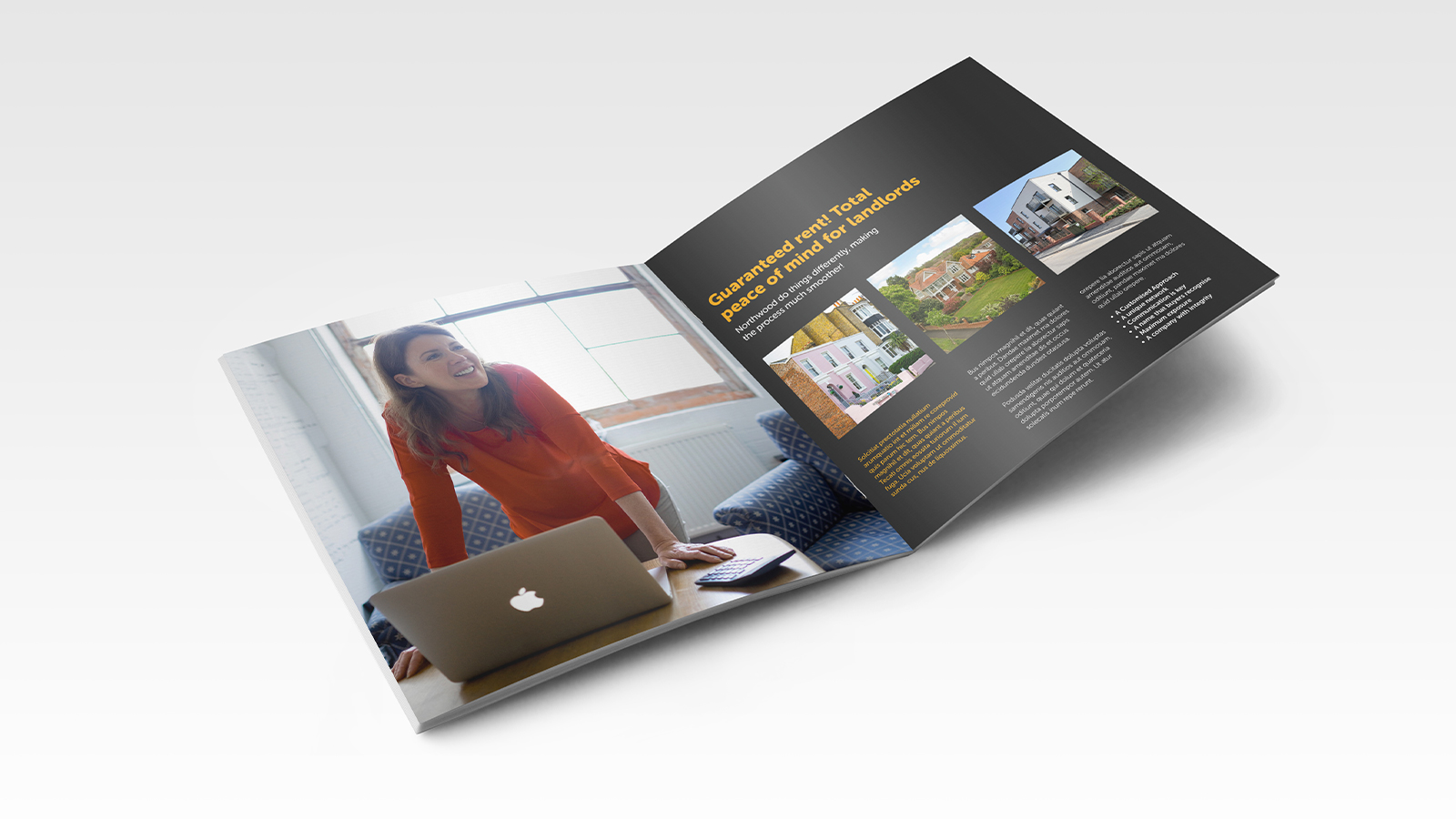
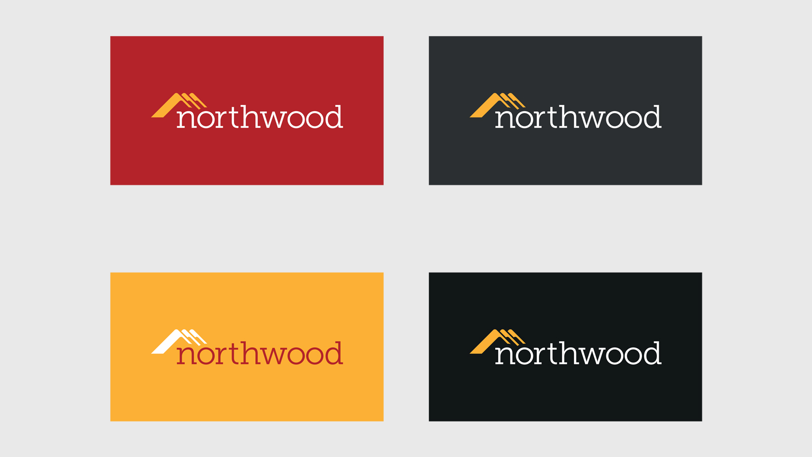
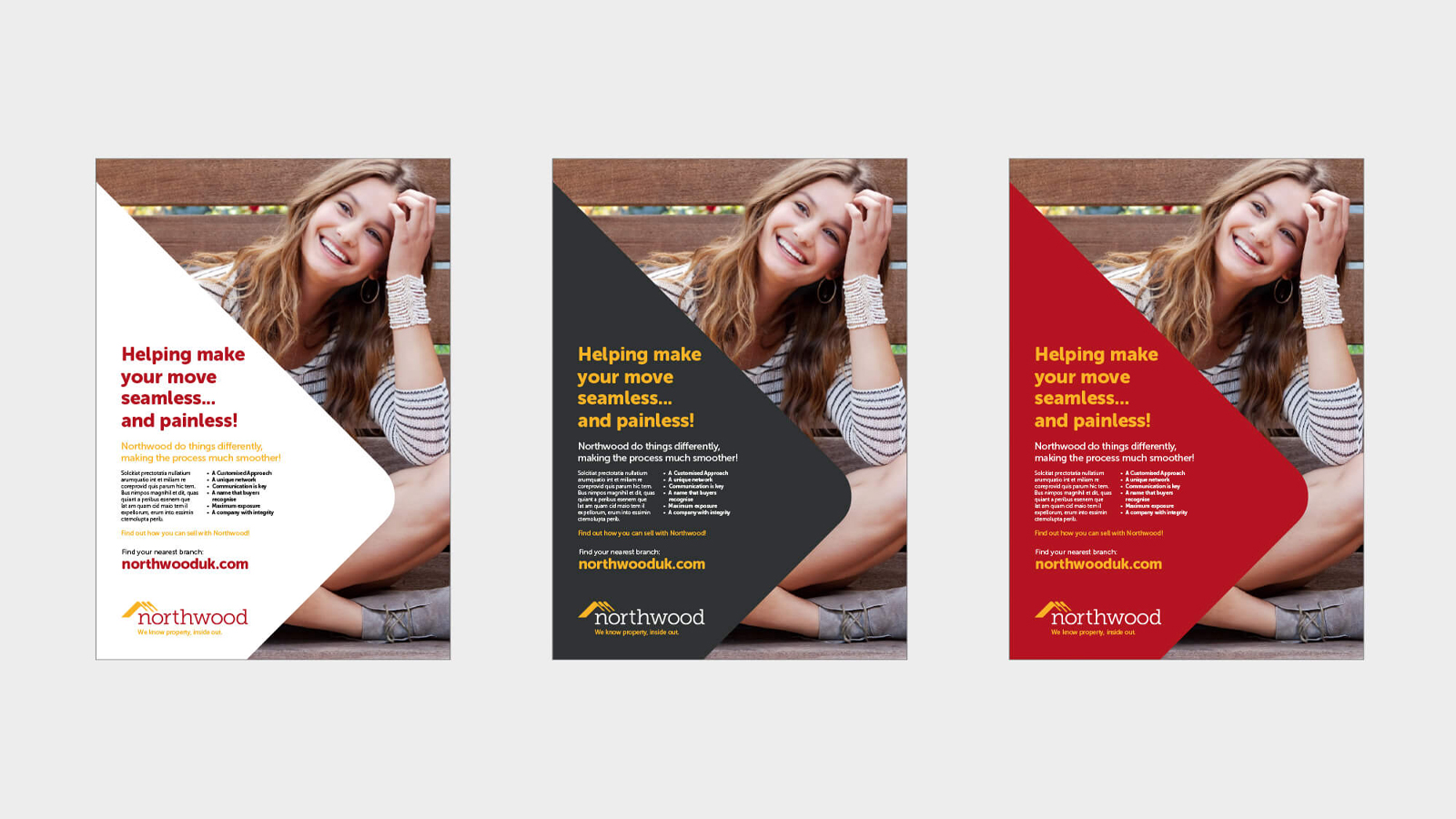
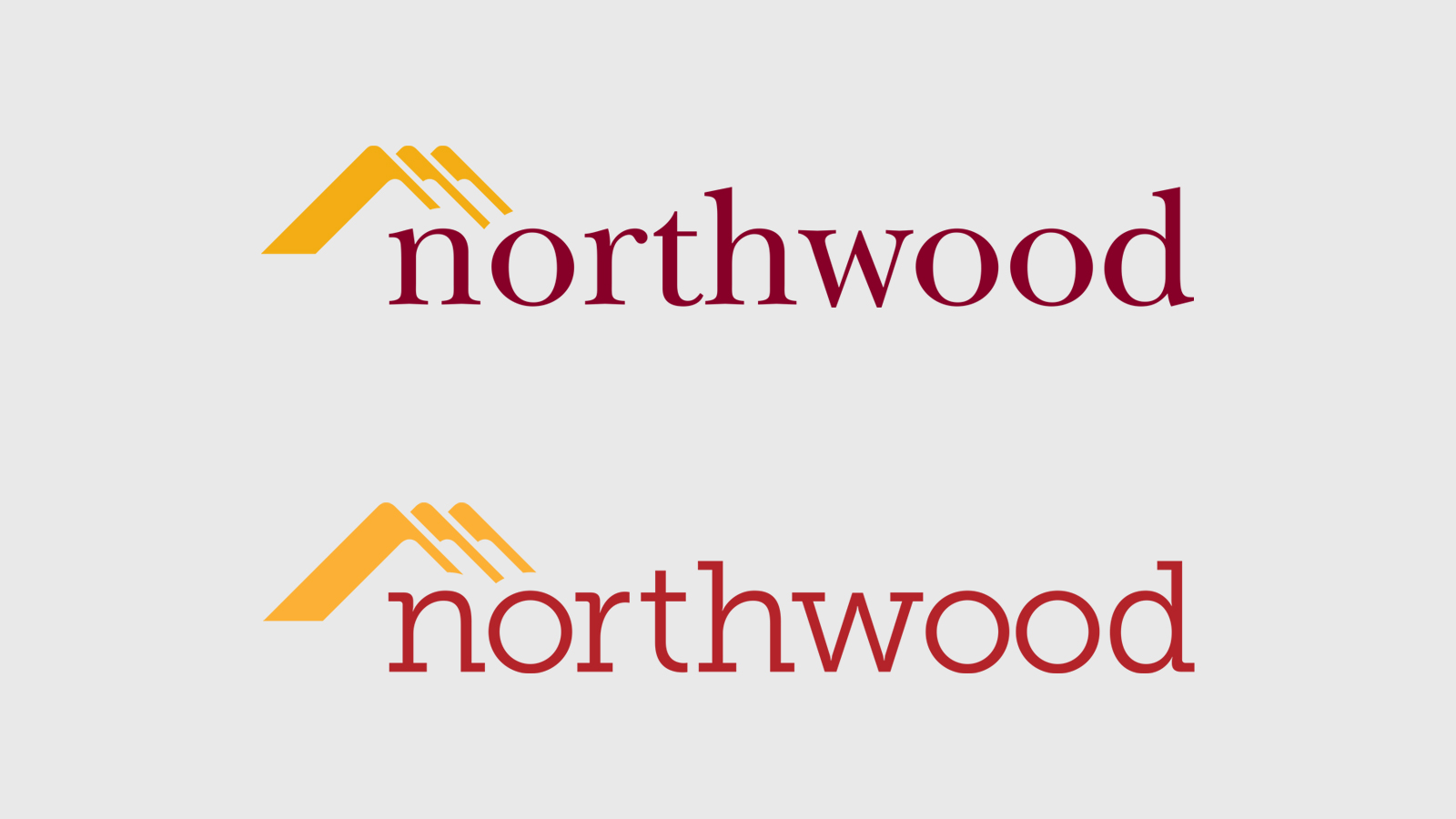
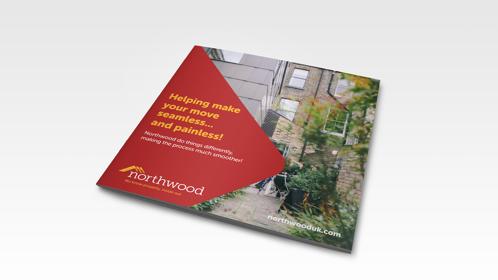
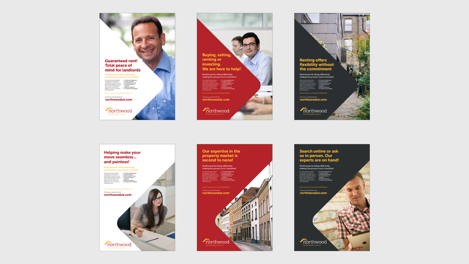
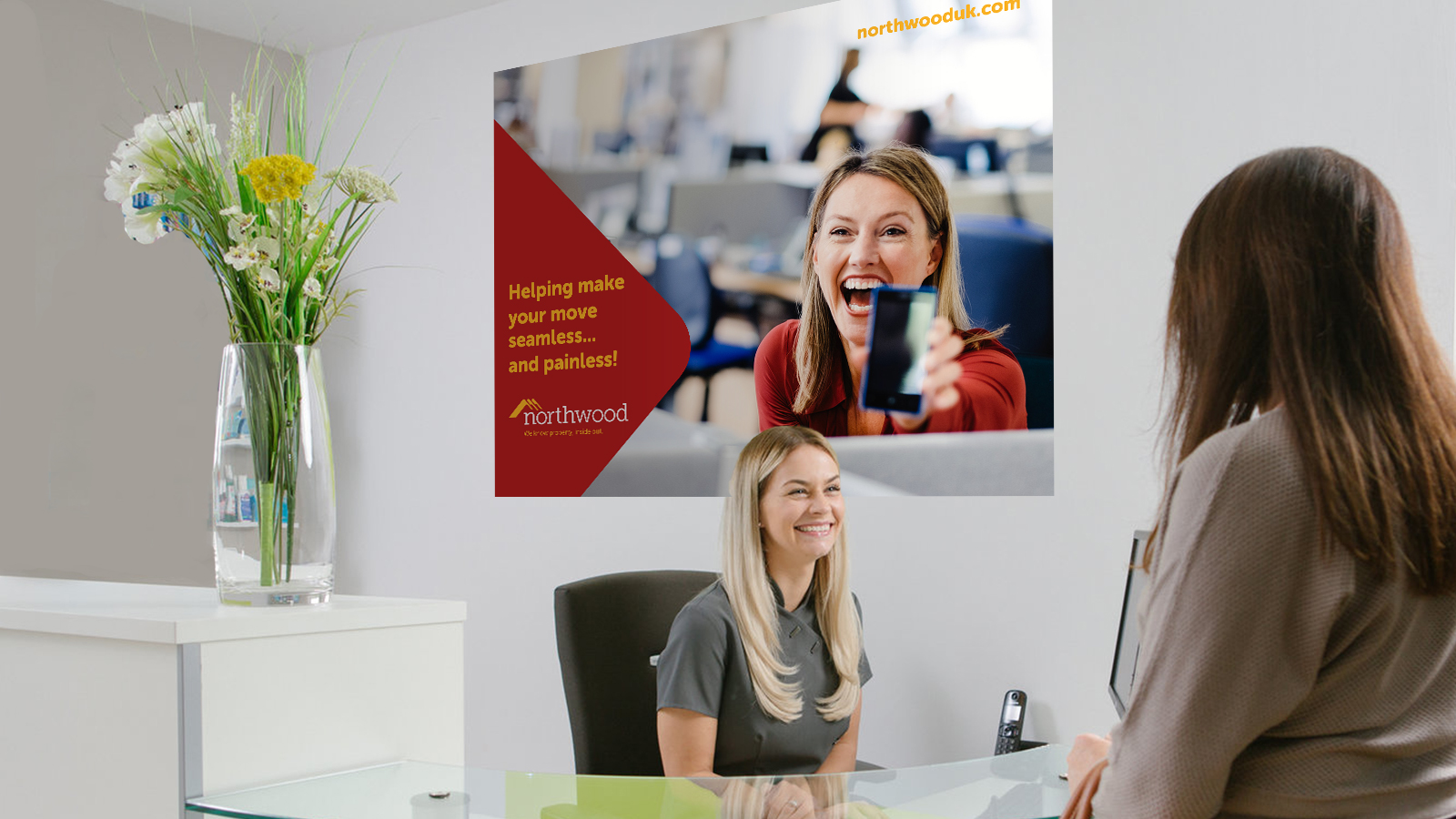
The refresh centred on subtle but purposeful change – a refined typography and updated colour palette gave the logo a more contemporary feel without breaking what already worked. From that foundation, a new strapline was developed to sit alongside the mark: direct, descriptive and built to last. A distinctive graphic language, derived from the geometry of the logo icon itself, was then used to create a consistent visual style adaptable across every medium and message.
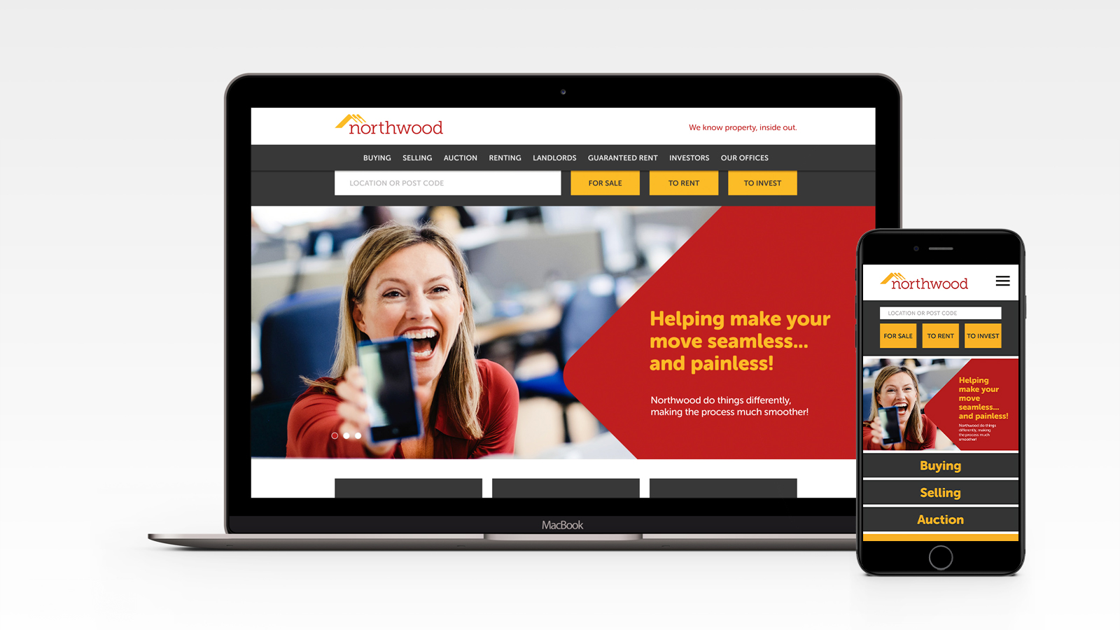
I led the full creative development of the rebrand – from initial identity concept through to delivery across all channels. This included logo refinement, strapline development, art direction of the photography style, and the creation of a flexible design system that carried consistently across print, digital and web-based platforms.