Gemini was born from the merger of two established companies coming together to form a single new entity. The challenge was to create a brand identity from scratch – one that could carry the weight of that union, signal a confident step forward, and work across the full range of channels a newly launched business would need from day one.
Two companies were merging to form one new business under the Gemini name, and a complete brand identity was needed to mark the occasion. The work had to communicate the spirit of union and forward momentum – and be robust enough to carry across corporate identity, literature, digital, exhibition and video from launch.
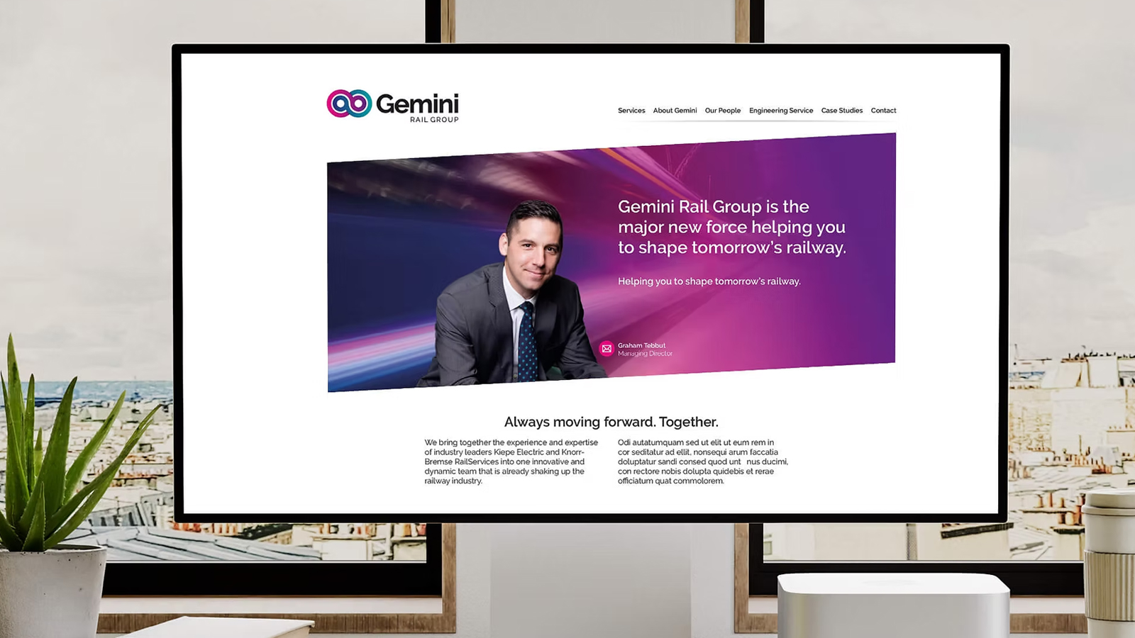
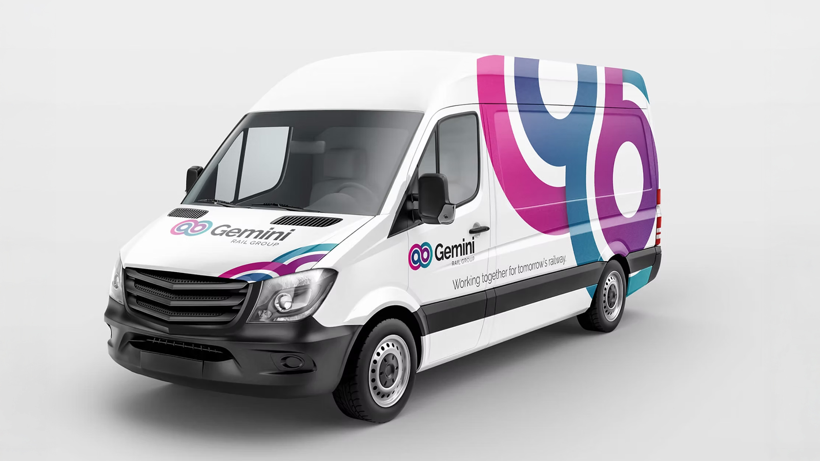
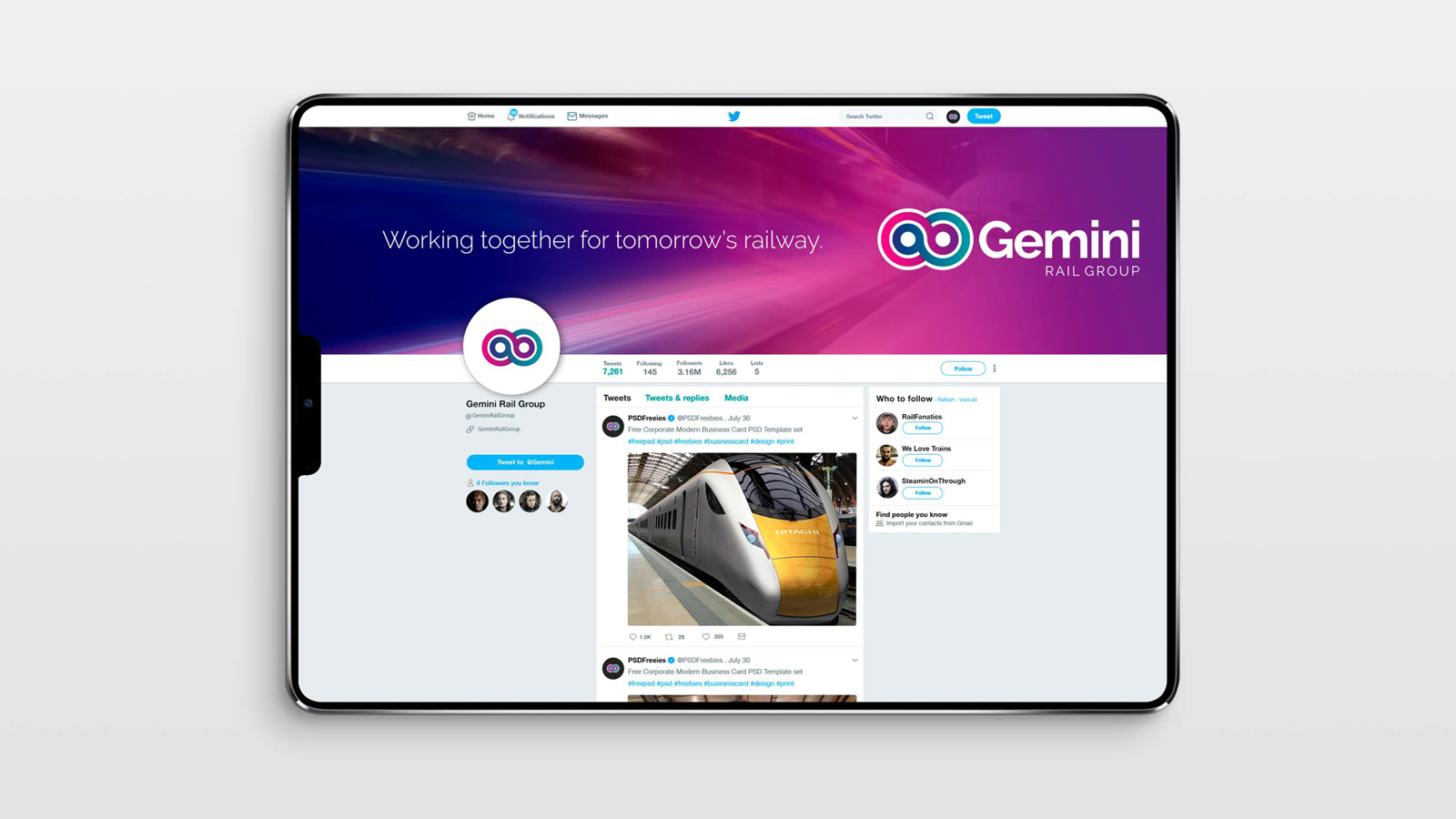
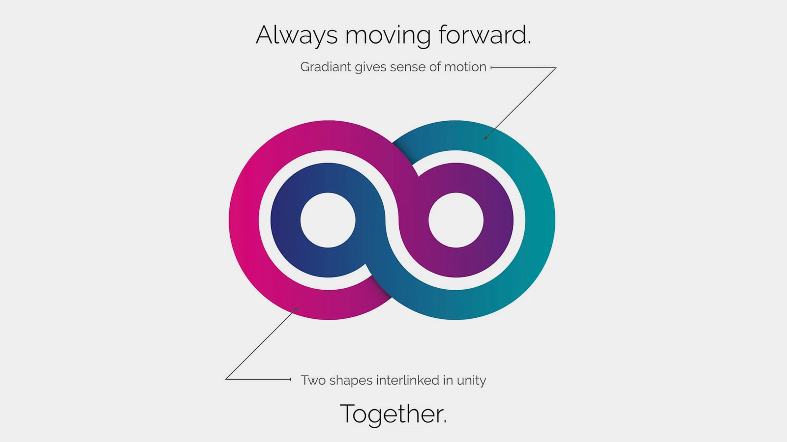
The identity was built around an interlocking icon – a simple but deliberate symbol of two separate entities coming together. A bold, energetic colour palette reinforced the sense of forward motion and fluidity, giving the new brand an optimistic, future-facing character. From that central mark, a full design system was developed capable of working across every application the business required.
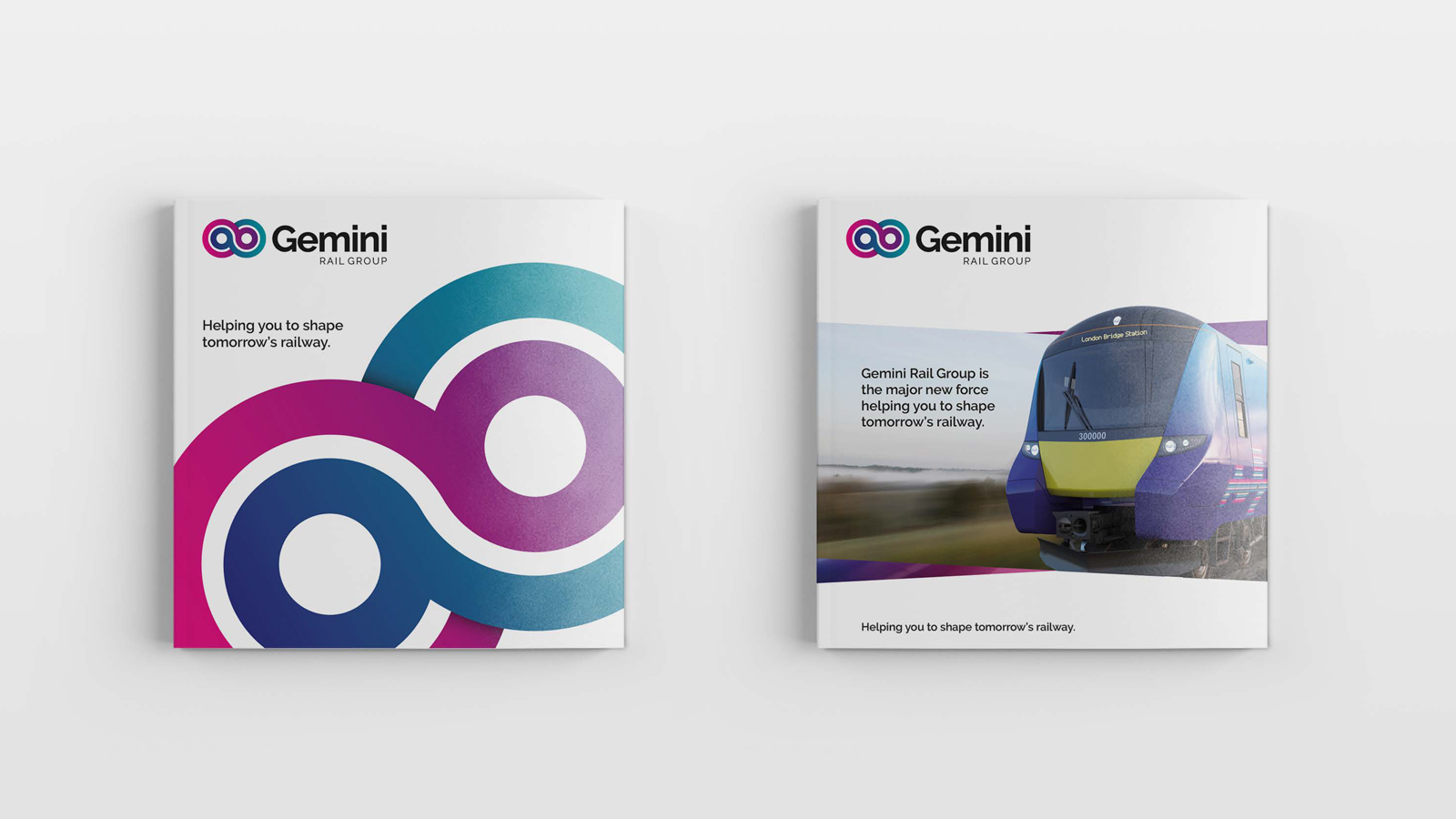
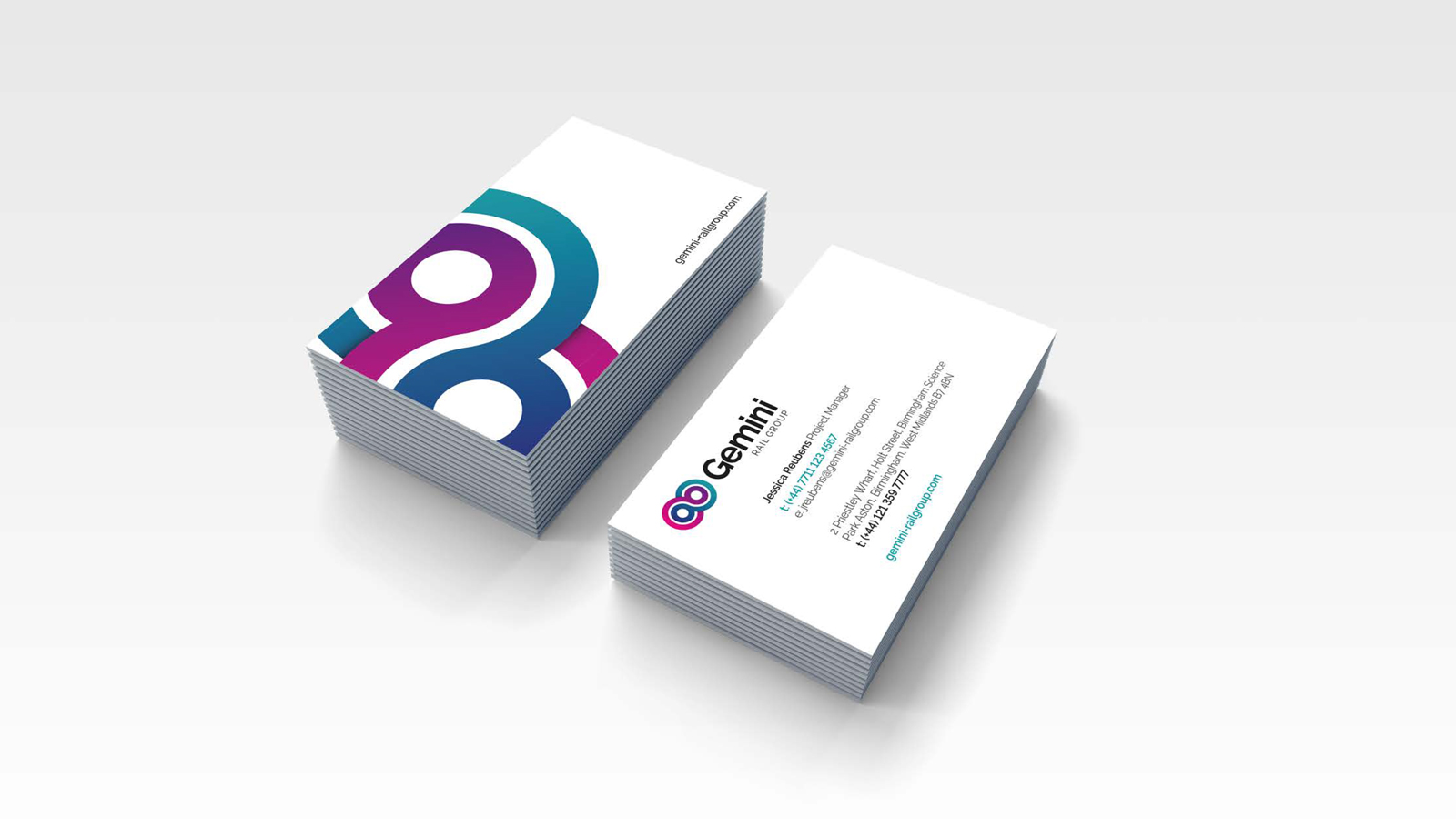
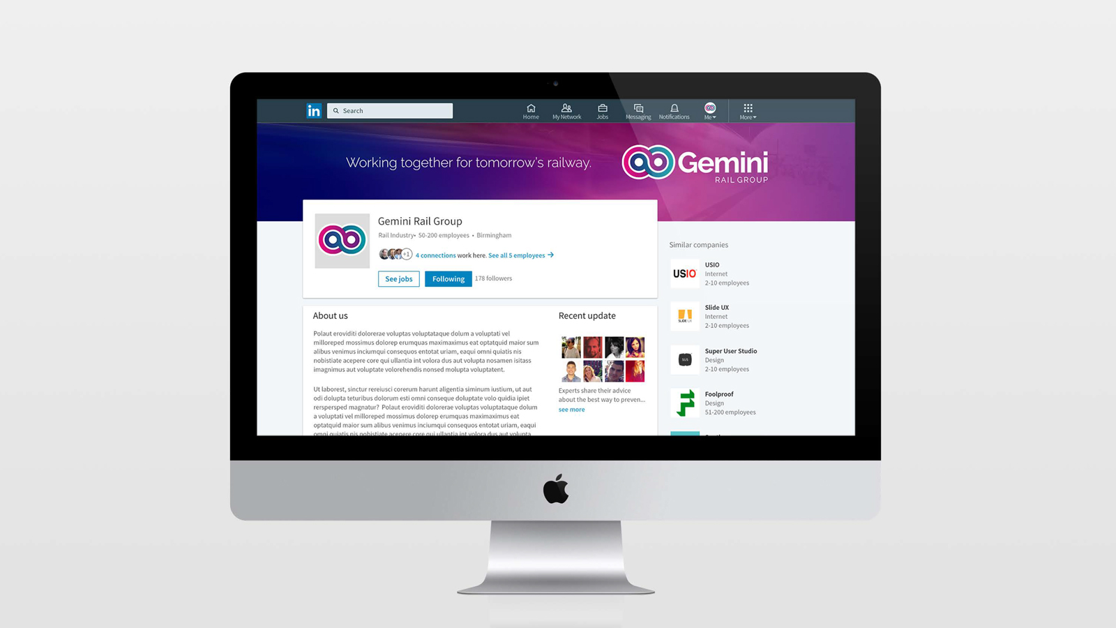
I led the project from initial brief to finished design – developing the logo concept, building out the full brand identity, and producing the complete suite of corporate identity elements for both physical and digital distribution. The brand launched successfully and has since extended into the website, video productions, exhibitions and a comprehensive range of literature.